3 month side project • End-to-end product designer

Scoliosis often leads to physical discomfort such as chronic backache, fatigue, and even inconvenience in mobility. In this project, I explore how people manage their condition with a self-care approach, which is conducting rehabilitation exercise program at home.
"Successful outcomes for home exercise program are directly correlated to the patient’s adherence." - Christopher Vara, MD 2019

I proposed a mobile app that help people set feasible exercise goals, manage exercise tasks, and get access to supportive online community to received feedbacks to learn and discuss exercise with fellow scoliosis warriors.

Setting feasible exercise plan and reflect on how well you achieve it.

Access exercise database and follow the correct ways of conducting exercises
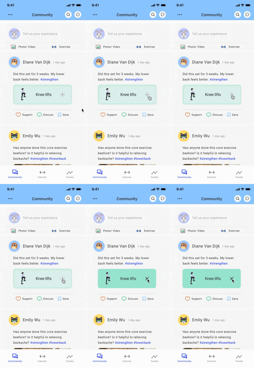
Taking advice to alleviate doubt in exercise efficacy.
I reached out to physical therapy at UM to understand how current home rehabilitation exercise program works. Below is the general process of home exercise program.

Online Survey
The survey asked about scoliosis experience, general exercise habit, and the challenge when they conduct rehabilitation exercise.
Semi-Structure Interview
With contact information in the survey, I reached out to 3 people to join telephone interviews and help me contextualized the challenge they are facing.

Since there weren't existing solution supporting home exercise program specifically for people with scoliosis, I studies 4 apps - BackExercises, TrackActiveMe, Workout, and HealthySpine - which aim at providing home exercise for people with chronic backache.

I synthesized all the findings in the research into a user journey map and identify the design opportunities (black) based on it.


Help people set feasible exercise plan and encourage them to stick to it.
Find a way for people to efficiently collect customized exercise content.
Provide a way to receive advice to alleviate doubt in exercise efficacy.
Based on three design opportunities above, I brainstorm ideas with 3 storyboards and brought them back to the users for feedback. I choose the ones that most users thought work best for them as the design concept.

.jpg)

Having design directions in mind, I create information structure for the app to order my thought about the product. Then I create low-fi prototype and conduct 3 usability tests to get feedback for improvement. The questions asked in the testings focus on validating the structure of the app and finding the missing elements in user flow.
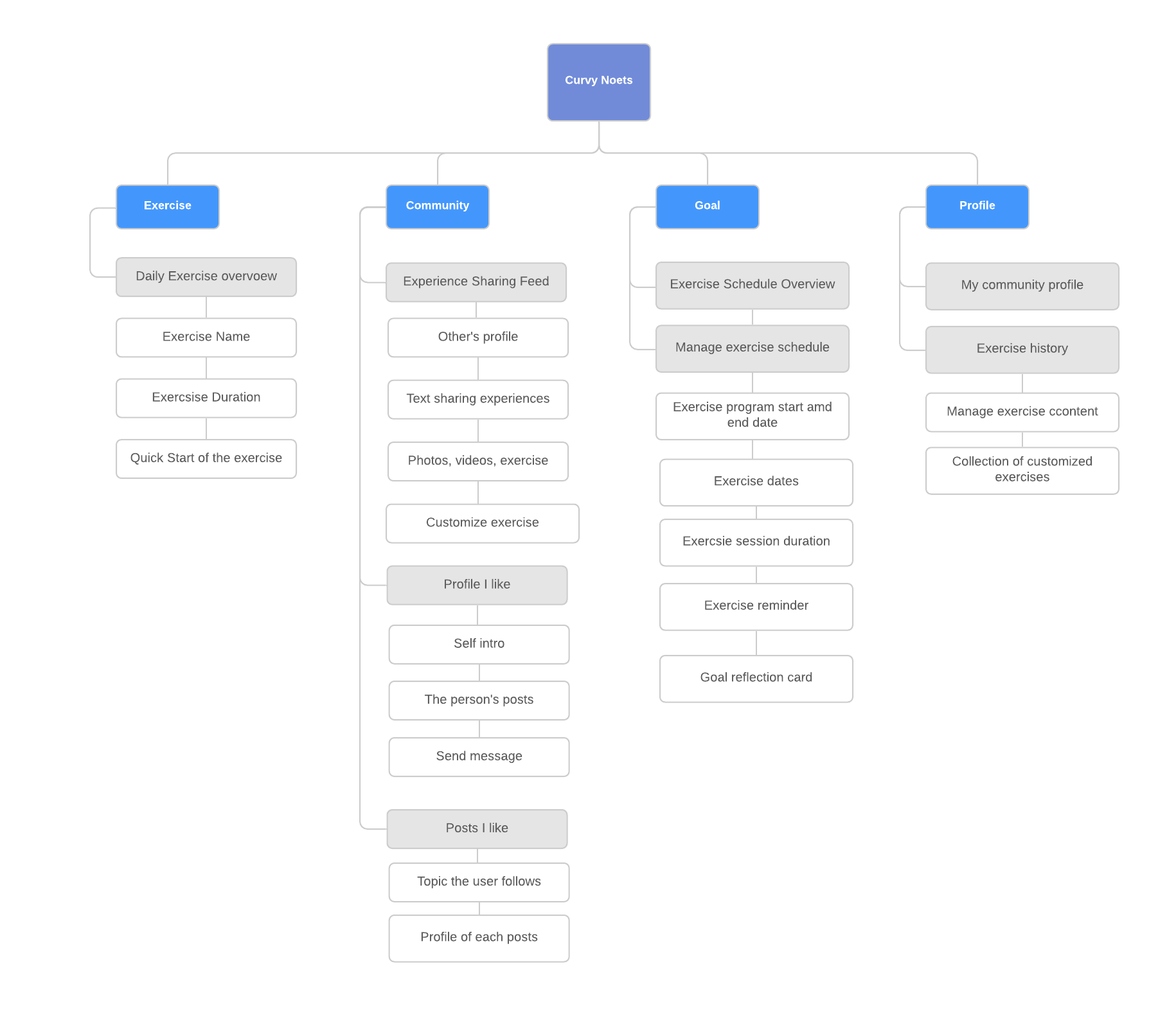

I adjusted the structure of the app by dividing content within the profile tab into other tabs. Then I renamed and adjusted the icons for better understanding and visual consistency.

I added a message icon on the first screen so that users who already built relationship with the community can directly send a message to people they know.

I added history tracker to help users better compare the completion rate of each exercise goal.
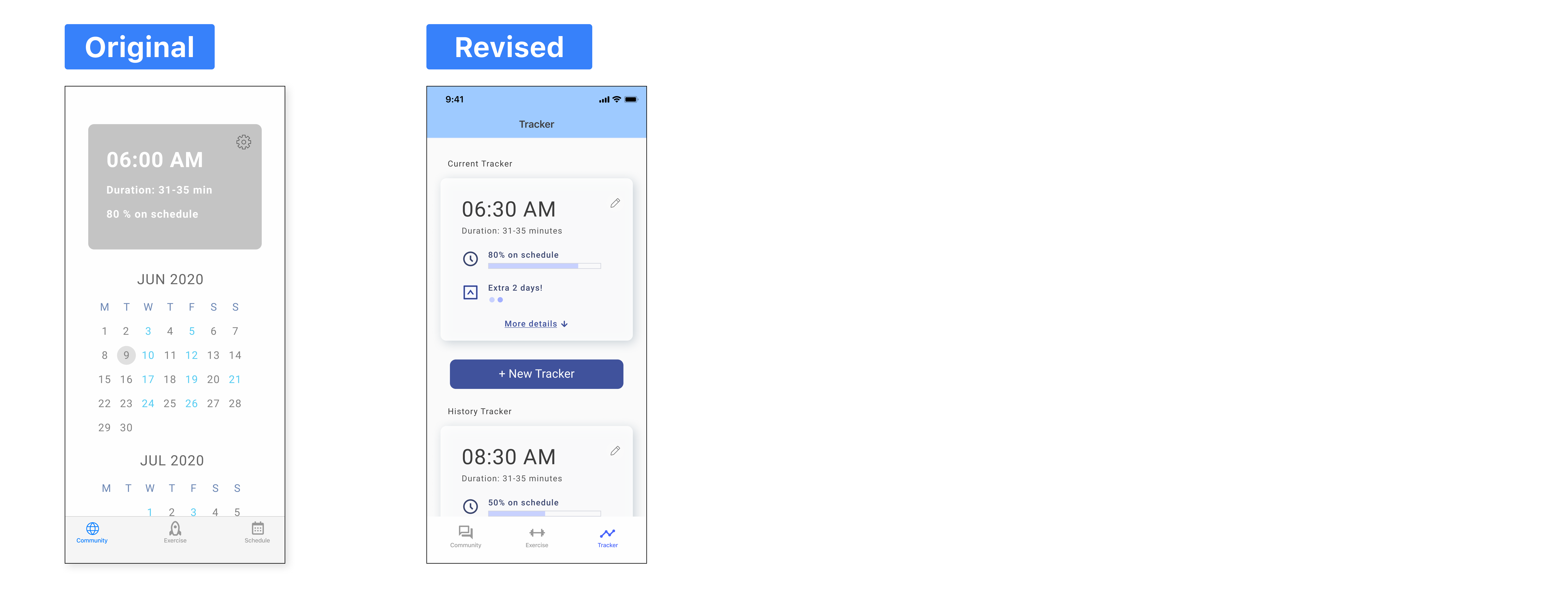
I adjusted the UI elements for the usability.

I also explore the color variation for indicating daily exercises.


Think about the feasible start & end date of the plan, exercise duration, and time to receive reminder.

Reflect on how you keep up with the goal and compare the current tracker with your history trackers.
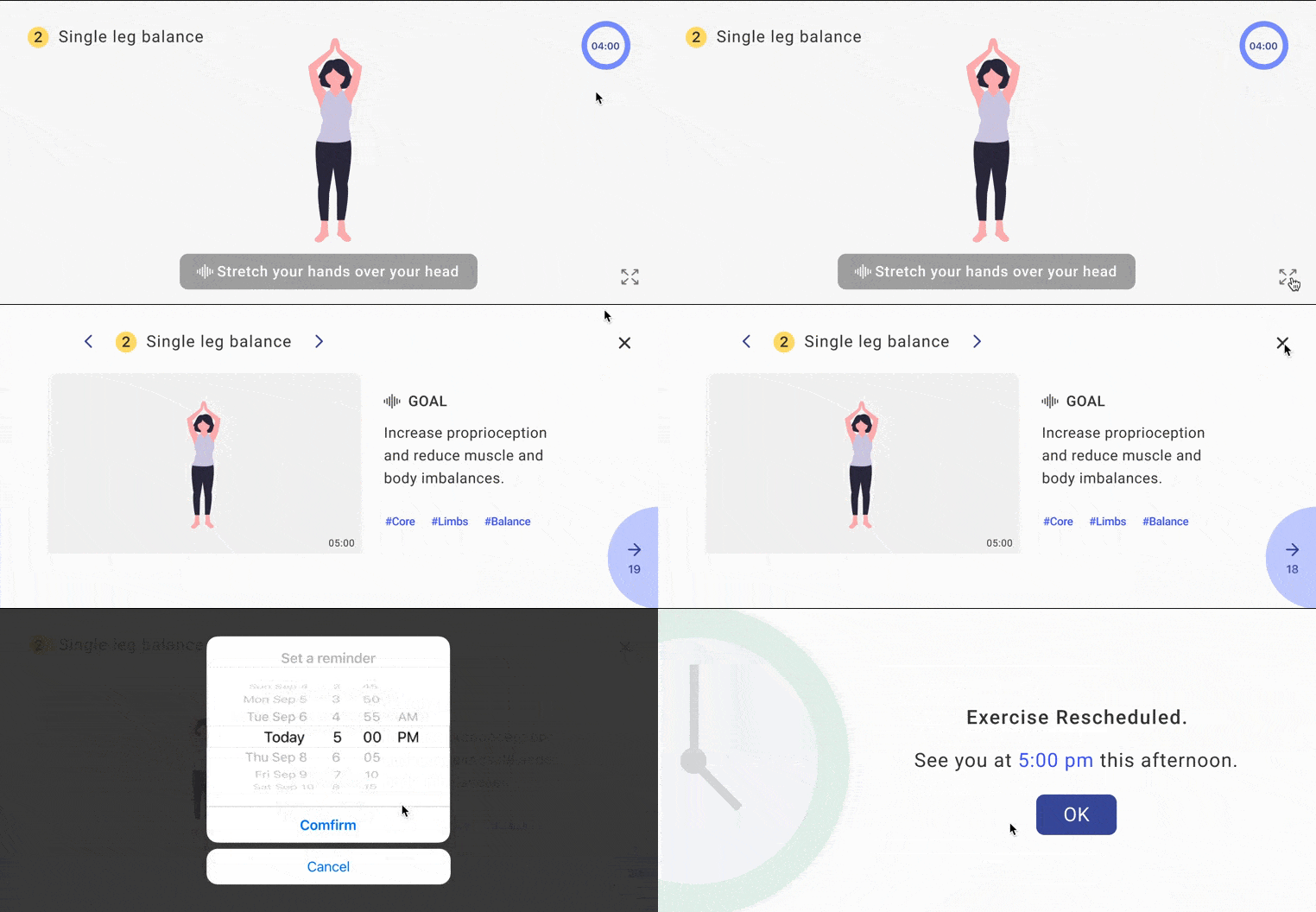
If interrupted by other tasks, you can quickly set up reminder and come back to the exercise session later.

Share thoughts through words, pictures, videos, and the exercise instructions. Save the ones that are helpful.
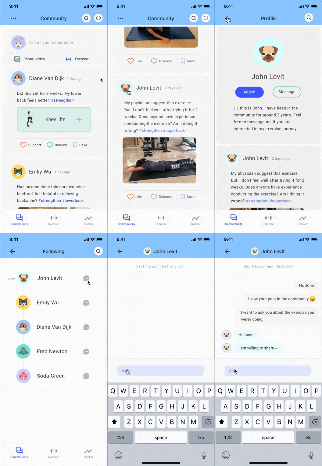
When finding people with similar experience, add them to message list and ask questions through private message.

See exercises suggested by trust-worthy people and quickly add it to your daily exercise collection.
The idea of sharing design that is not perfect was nerve-racking to me. However, when I showed my design and asked for feedback, I always felt enlighten by the feedback and appreciate the perspectives come from people with different standpoints and backgrounds. I learned that borrow a couple of extra eyes can encourage me to reflect on each of design decision and make sure the design proposal is more well-rounded and unbiased.